You get a single chance to create a first impression in your reader’s mind.
Choosing the right font is absolutely mandatory for your book to be easy on the eyes. Both the interior pages and your front and back covers should be carefully assessed for the most suitable font.
The book fonts that are loved by majority have evolved after hundreds of years of designing iterations and evolution. Some eye-catching designs are seen to emulate the styles of hand writing; and some other noteworthy designs display crisp, clean serif designs that are most commonly found in other publications. Font selection is important to enhance the final look, feel, and readability of your book and from the designing perspective too.
Modern fonts have resulted from people combining and creating something new into something magnificent. Fonts are size, weight, and style variations on typefaces. The decision to choose the best fonts for books is backed by the knowledge of science behind it.
Visualize all the places you see typed today. Whether it’s a phone, a computer screen, a book, a magazine, or a menu. Almost all our time is spent reading something every day. And other than the menu at the restaurant perhaps—much thought has gone into which font to use.
Choosing the ‘right’ font to use for a book often depends on the individual taste of the author and publisher. There are a few points that a book designer should keep in mind for better results.
It is important that your font looks nice on the page, but it is also important that it is easy to read so that the readers can concentrate on the words without getting distracted or having to struggle to find out what is read.
Readability is measured by the degree of visual comfort a reader experiences while reading the contents at a stretch. Readability relies majorly on legibility, which refers to the ease with which a person can distinguish one letter from another.
Factors controlling the readability of a typeface include spacing between two adjacent letters, the height and thickness of letters, and the size of the serifs and the style of depiction.
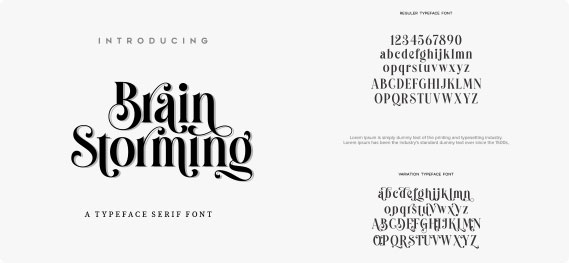
Serif fonts help in increasing readability and are therefore the most preferred font for a book. The decorative stroke of the “serif” that occurs at the end of a letter makes it look artistic. Serif fonts are easier on the eye compared to the sans-serif fonts.The ending stroke connects the reader’s eye travelling from one letter to the next while reading continuously. Serifs help to lend the text a wholesome togetherness. It makes it easier for the eye to travel and recognize each letter of the text and also lends speed while reading long continuous passages or chunks of text.
At the same time, reading a line of text printed in sans serif might be tiring to the eyes and the reader might need frequent breaks to take their eyes off the book at intervals. For this reason, sans-serif fonts should be used for book headings and other uses where the text is in isolation or demands attention. Font choice is thus one important component of typesetting that serves to improve readability of a book.
What message is your book trying to send to the readers?
The author wants the content to look welcoming and pleasant to the eyes too. Depending on the book’s theme and subject, it will carry a definite message. It might belong to various genres such as mystery, romance, self-help, motivational, business or finance related, and more.
The typeface is an integral part of a book. Book designers study a manuscript minutely to get to know the subject and tone before deciding on a text font. The right text font when chosen diligently adds to the author’s message. If the font and subject complement each other, the text will read easily and will just go with the flow of the writing. This explains well why companies spend so much money on getting print ads right. Because they need to ensure that they are sending a clear message to motivate the consumers to buy the product or service.
To draw your reader in, you will want a modern, stylish font that will appeal — but this is pretty subjective, so go with one that you like. Your font choice should also be dictated by the theme and mood of your book. You can afford to show your creativity with titles and headings that attract the reader’s attention and help in adequately capturing the spirit of your book. You can spread your creativity even with the body text, taking care to match the sense of your book. Some of the so-called font rules can be overruled depending on the need of the book.
A newspaper article or a book makes us feel that the words themselves tell the story. By now you must have understood how much typography, typeface and font are important in narrating your story and getting the readers to be emotional.
Well, they sure can be.
Your brain captures the lettering of a text as an art form. Typography is indeed the artistic rendition of the letters. And your mind forms an impression even before you’ve read the title. Even before you realize, your subconscious mind draws a few conclusions about every book that is solely based on its typography. For example, questions like is it professional or amateur or is this for people like me; was it written by an expert or some layman! Is it serious or funny! Will it be easy or difficult to comprehend? And how much effort and thought went into its designing?
With so many choices, how do you find the best fonts for your book? Think from a book designer’s perspective and give a thought to the message and tone that the book carries.
Try to be consistent with one font family. Choose the main font for the body and one additional bold or semi-bold version and an italics version, and a sans-serif font for the titles. You can choose a similar font for the chapter titles, but limit yourself to that.
Using too many fonts, along with overuse of bolding, italics, and underline, defines unprofessionalism.
So, keep it simple and professional.
The need to bold, italics, and underline text in a book will occur rarely. Bold might be used for defining the headings. Italics can be used sparingly for emphasising certain words, to add emotion to an expression or to set the tone of the text, to indicate foreign words or publication titles, etc.
At the very start, picking the right typeface will ensure that your book is easy to read and conforms to the popular and proven book publishing practices. And that’s no small thing.